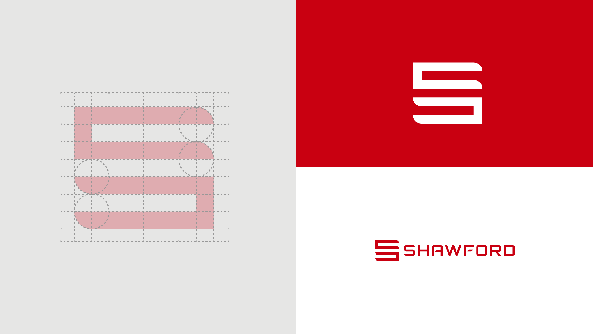
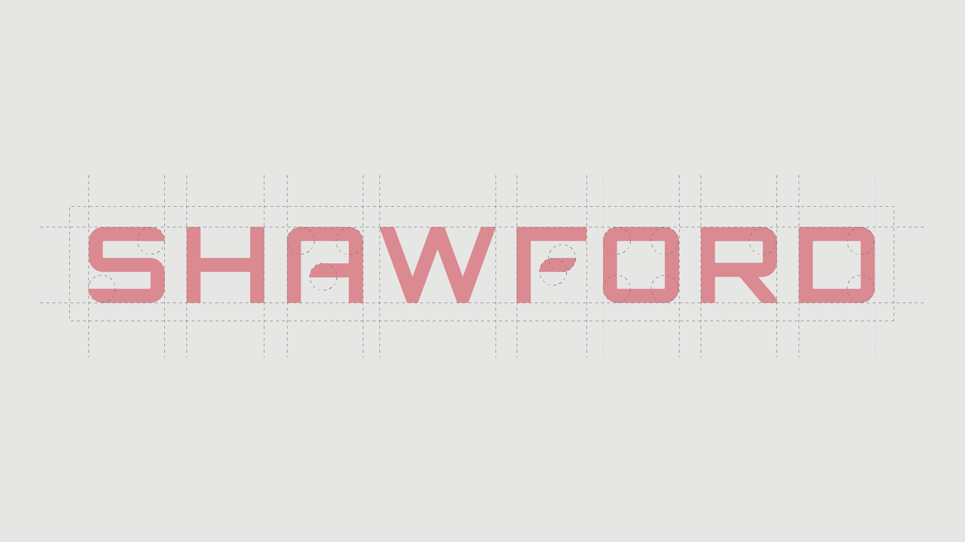
CLIENT - SHAWFORD INTERIORS PROJECT TYPE - VISUAL IDENTITY
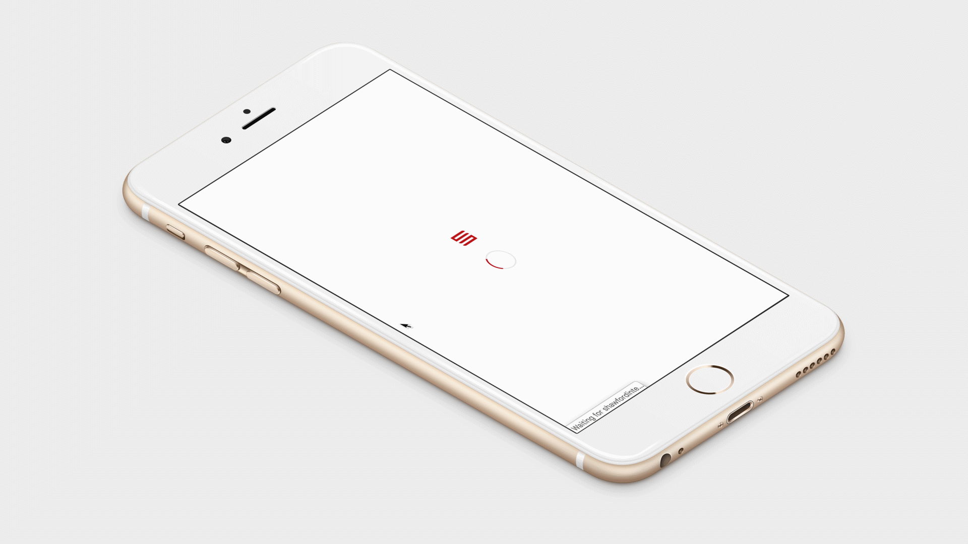
shawford interiors
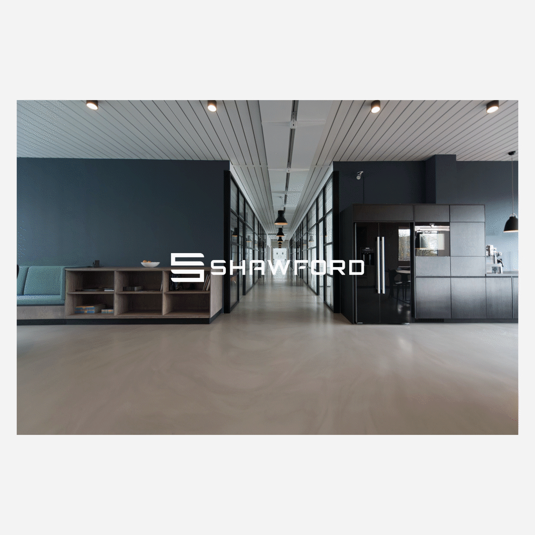
A strong and bold identity for a fast growing construction company
LOCATION - ROTHERHAM, UK
“As a construction business in a saturated market, Shawford needed to make an effort to push their brand and make a striking identity to raise awareness.’’


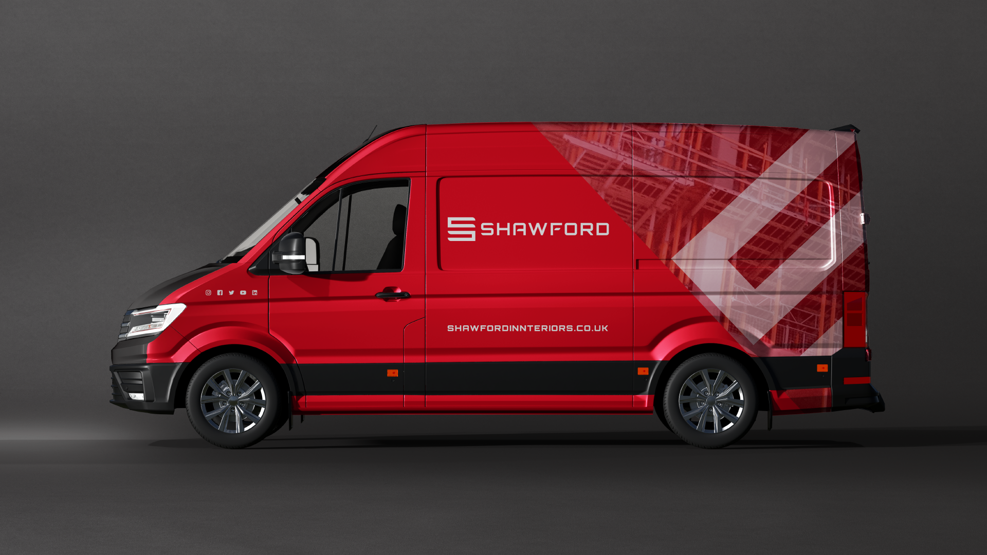

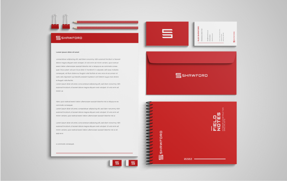
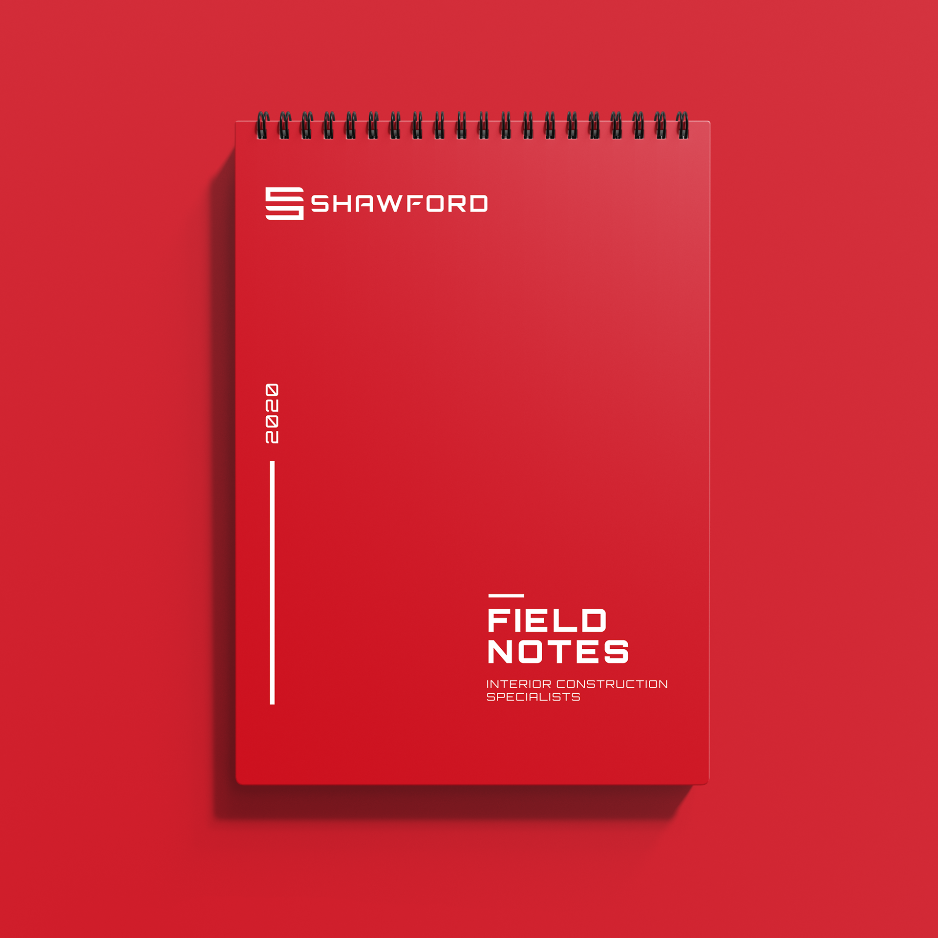
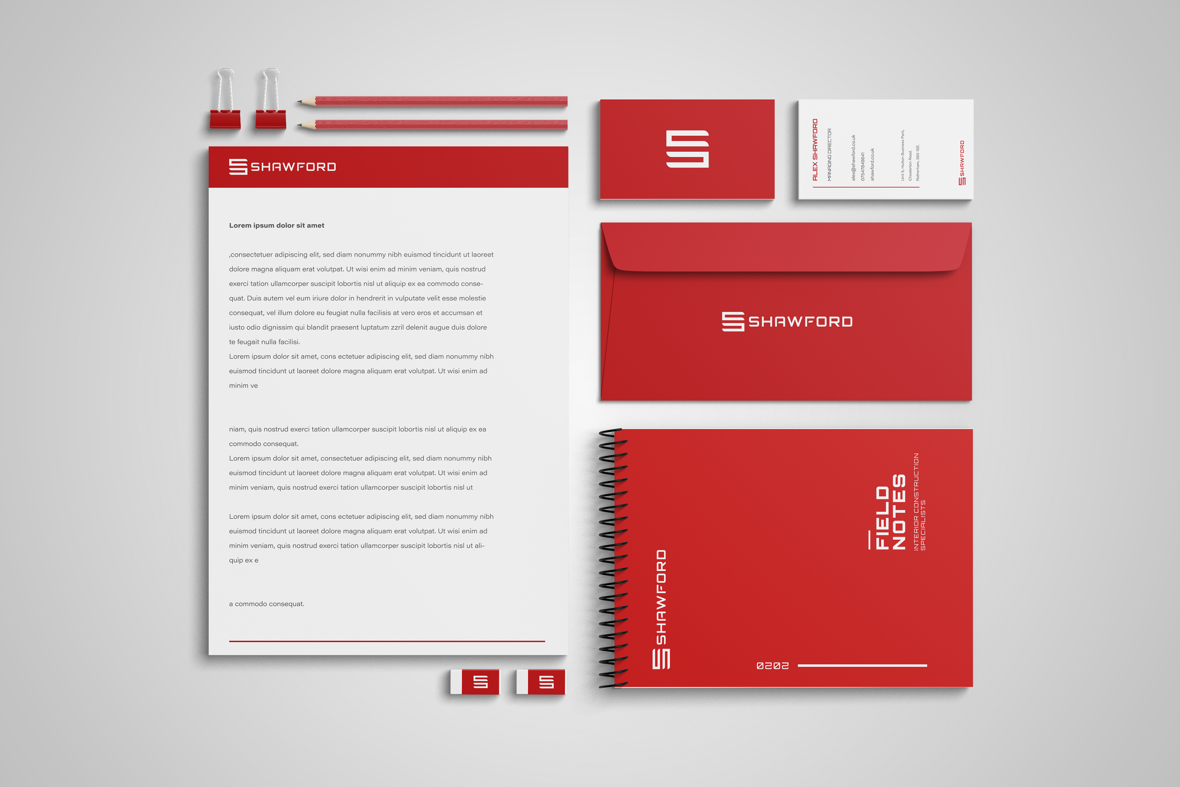
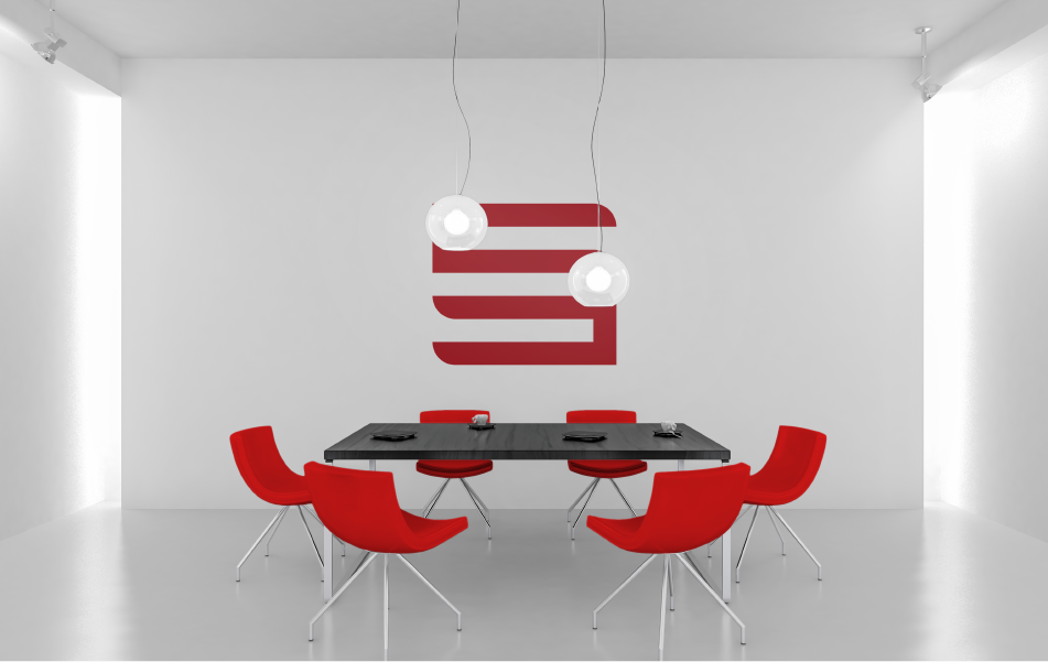
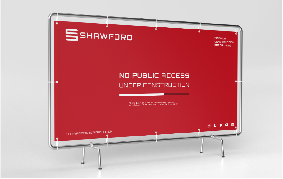
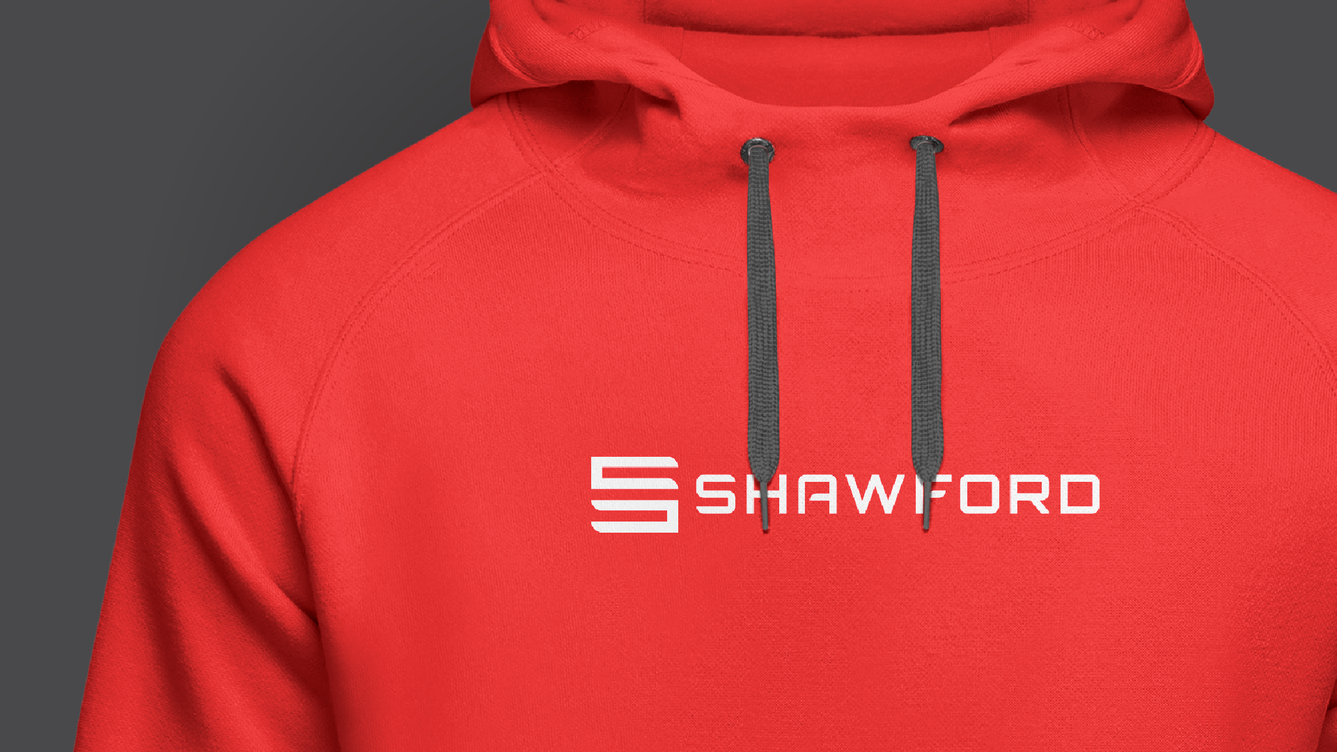
“When we were tasked to create a new logo for Shawford, we wanted to focus on creating a solid mark which is the 'S'. When we had the solid shapes down, the rest was quite simple. We choose a typeface which compliments the mark well, and the colours were inspired from Power Tool brand such as Hilti and Milwake.’’

“The whole idea was to strip back the design and create a simple an effective identity.’’